
We take a keen interest in the Digital Marketing world – we read extensively – we want to know what’s going on and we want to know what’s coming up.
This is partly because we want to let our clients know what changes to expect in 2017 to their Social Media offerings, SEO, Email Marketing and Web Design trends. Some don’t care but some want to stay on the pace, to go with the flow and perhaps stay ahead of the game. We prepared a briefing document with our thoughts which we thought we’d share with you.. These are what we think the trends are for Web Development.
Web Development
1. Layouts that let content shine
A fascinating element of recent design evolution has been the shift back toward a focus on content: the meat on the bones of the web. Designers worldwide have realized that people visit websites for their content — whether it’s raging tweetstorms, thoughtful long-reads, or the latest “user-generated” meme — and that design’s ultimate role is to present content in an intuitive, efficient, and glorious way.
2. Better collaboration between designers, and between designers and developers
Design has taken a greater and more influential role in shaping businesses, more and more attention has been paid to designers’ collaboration with both their fellow designers, and their developer colleagues. It is only a matter of time before design and prototyping tools replace front-end development altogether, seamlessly producing a high-quality front-end code base for your framework of choice.
BOLD TYPE!
4. Big, bold type
As the design world comes to the consensus that our focus should be on content, more and more websites feature lines of resonant, inspiring copy set in type that’s just as big and bold as the statement itself.
5. Complex layouts rooted in graphic design principles
If we want to predict the evolution of web design (at least in visual terms), we should refer to the evolution of graphic design. For the past few years, web design layout has been constrained by CSS’s limitations, but new tools like flexbox and CSS grid (coming in March 2017!) will allow for much more expressive layouts on the web.
6. More SVGs
SVGs (scalable vector graphics) present web designers and developers with a lot of advantages over more traditional image formats like JPG, PNG, and GIF. The key advantages of SVGs come through loud and clear in the format name itself: scalable and vector. Instead of being raster or pixel-based, SVGs are composed of vectors: mathematical descriptions of the object’s shape. This means SVGs are resolution-independent, so they’ll look great on any screen, on any device type. No need to worry about making everything retina-ready.
7. Constraint-based design tools
Hence a new wave of design tools (such as Figma) that use the idea of constraints to lessen the amount of repeated work designers have to do when building cross-device layouts. These tools focus on the spatial relationships between elements and strive to preserve them as composite elements are resized by devices and users.
8. More and brighter colour
As movements like minimalism and brutalism came to the fore in 2016, designers sought ways to infuse more personality into their design work that still worked within those stripped-down aesthetics. And in at least a few cases, bright, bold colour became the natural answer.
9. More focus on animation
Animation has long played a key role in our digital interfaces, and there’s no reason to think that’ll abate in 2017. In fact, as designers get more and more visual tools to help them build engaging and smile-sparking animations, we’re sure to see them become both more prominent and more refined.
10. Unique layouts
Overdramatic as the web-design-is-dead argument may be, you can’t blame any creative for seeking innovative ways to present content to readers. And one of the most enticing methods for breaking out of the box-centric layouts many blame responsive design for is the broken grid.
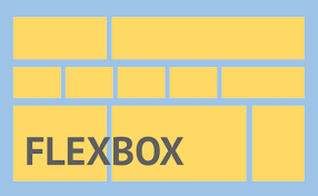
Example of a flexbox layout
11. Flexbox
If you haven’t dived into flexbox yet, you’re in for a treat. This relatively “new” CSS layout module offers both incredible responsive-friendliness in its functionality, but also makes a lot of sense to visual designers used to manipulating objects on the canvas with the align and distribute tools offered in the likes of Sketch and Illustrator. And with every modern browser (and no, we’re not counting IE11) now fully supporting flexbox, there’s no reason not to dive in — as long as your audience isn’t full of IE diehards.
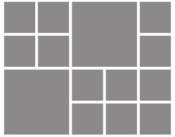
Example of a CSS grid layout
12. Complex CSS grid layouts
Coming up hot on the heels of flexbox in the race for newer, better layout modules is CSS grid. Grid is the very first CSS module created specifically to solve the layout problems we've all been hacking our way around for as long as we've been making websites. While flexbox helps us solve some seriously aggravating and long-standing web design problems like vertical centering, it really wasn’t intended for use in full-page layouts. (Though it’s certainly capable of them.) Grid, on the other hand, was built for full-page layouts. And like flexbox, it allows you to easily rearrange content order for different media queries.
13. A focus on designing for content delivery, personalization, and conversion
One consequence of an increased focus on design as a means of effectively delivering content will be a stress on delivering said content to the right person at the right time — all with an eye to increasing desired actions, naturally. (All good news for you content strategists out there!)
14. More focus on conversation (yes, bots, but also...)
You might call 2016 the year of the bot — though whether it’s been the beginning of the bots’ triumph or just a somewhat underwhelming launch is very much open to debate. That said, if the volume of bot-related launches on Product Hunt and Google’s deep integration of Assistant into Android are any indication, 2017’s going to see a lot more bots popping up across your life.
15. A new designer deliverable — code — created in new ways
In his TechCrunch article “The future of front-end development is design,” Carson Miller writes:
Coding is going to look dramatically different in the future. In fact, the line between design and development may no longer exist. A conversation about the article sprung up on Twitter, where Austin Knight noted: “Many designers and devs that I know would prefer to work visually, but work in code out of necessity.” There are many drivers behind this emerging reality, including the need for fast, iterative product development. Users need for more equivalency between outputs and inputs (i.e., most painters don’t paint with code), Increasing sophistication of code-free design tools.
.jpg)
16. Virtual reality ... on the web
Given our already firmly founded tendency to think of the web as a kind of alternate reality. But there’s no denying that VR is going to affect the web in a big way in 2017 — even if browsers won’t be ready to support it.
Websites are our bread and butter and it's what we do best. They come in all shapes and sizes and we can build whatever you need. From simple brochure-ware websites to more complicated ecommerce solutions, and then bespoke solutions. Harness this to our proven SEO and PPC offering and your business will start to fly. And then of course for the full service... we’re really good at Social Media Marketing.